Screen Builder
Complete POS guide · Start a POS trial · Setup checklist
Screen Builder
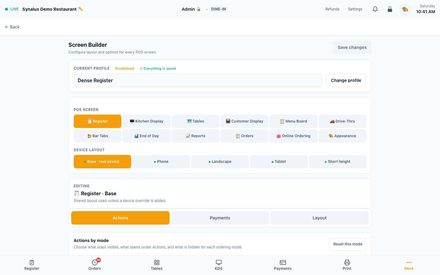
Configure every POS screen from a single settings page — button layout, split modes and limits, tip controls, hold timing, login methods, kiosk lock, receipt format, grid columns, display toggles, item sizing, and responsive presentation. Configuration is stored in named venue layout profiles rather than only in the current browser.
Navigate to: Settings > Screen Builder
Profiles, persistence, and runtime precedence
- Create, save, and activate named layout profiles for the venue. The active profile is used by the venue's configured terminals.
- Each screen consumes the active stored layout at runtime; Screen Builder is not a documentation-only preview.
- Register settings inherit in this order: Venue profile → Revenue Center profile → Station override → Device layout. The most specific configured value wins and an unset value inherits from the previous layer.
- The final Phone, Landscape, Tablet, or Short-height layer changes responsive presentation fields for that device without bypassing venue rules, staff permissions, or payment authorization.
- Upgrades preserve the historic behavior of two formerly display-only controls: profiles that have never explicitly set them continue to show Custom Tip and keep Receipt Logo off. The first explicit toggle in Screen Builder activates that control; the authorized Screen Builder receipt action can also activate Receipt Logo. After Save changes, the saved on/off value is enforced at runtime. This avoids silently changing a live terminal during an upgrade.
12 Configurable Screens
| Screen | Key Settings |
|---|---|
| Register | Mode-specific Persistent / Actions / Hidden buttons, tender and tip behavior, check/menu panel arrangement, item display size, responsive grid, imagery, toolbar, and receipt settings |
| KDS | Columns, gap spacing, ticket card size, all-day counts, age alert thresholds, per-station colors |
| Tables | Columns, table button size, elapsed timer, revenue display, heat map |
| Customer Display | Show modifiers, unit price, font size, idle content (promos/logo/specials/blank), tax breakdown |
| Menu Board | Columns, font size, show prices, show images |
| Drive-Thru | Columns, card size, vehicle description, elapsed timer, timer warning and danger thresholds |
| Bar Tabs | Columns, card size, show total, automatic tab naming |
| EOD | Tip pool section, cash denominations, denomination columns |
| Reports | Chart height, labor section, end-of-day by terminal, card brand breakdown, receipt preview |
| Orders | Which columns appear, summary bar, default tab, page size |
| Online Ordering | Grid columns, tile imagery and density, search, assistant placement |
| Appearance | Default theme, accent colour, font scale, theme toggle, compact mode, high contrast |
Device layouts — why a setting can look different on the floor
Each screen has a Base layout plus four optional responsive variants: Phone, Landscape, Tablet, and Short height. A terminal automatically uses whichever one matches its screen size, falling back to Base when you have not customised that size.
This is what lets a phone use a compact grid while a wide terminal shows more columns, without maintaining two separate menus. Column count is configured per layout and is not hardcoded to one value for every phone, tablet, or desktop. Device layouts change presentation only — never payments, permissions, or any operational rule.
That presentation-only restriction applies to the responsive variants, not the Base layout profile. Base and profile configuration also contains operational controls such as maximum tip percentage, allowed/default split modes, hold auto-send timing, receipt content, login-method visibility, and kiosk auto-lock.
Short height is worth knowing about: it is chosen by window height, not width. A laptop browser window with tabs and a bookmarks bar can be short enough to qualify even though it is very wide, so it can pick up the Short height layout rather than Base.
Because of that, the layout you are editing is not always the layout in front of you. The device tab that matches your current screen is marked THIS DEVICE, and if you are editing a different one, a note appears telling you which layout your screen is actually rendering, with a one-tap button to jump to it. If you change a setting and the screen does not change, check that banner first — you are almost certainly editing a different device size.
Register Layout Builder
Register settings are divided into three tabs so the editor does not crowd unrelated controls together:
- Actions — configure each ordering mode independently: Dine-in, Bar Tab, Quick Service, Takeout, and Delivery
- Payments — configure tender-specific tip prompts, excess-payment allocation, additional tip after gratuity, receipt tip behavior, suggested percentages, Custom Tip, and the maximum tip percentage
- Layout — configure the category rail, quantity selector, search and order-type controls, check/menu panel arrangement, item sizing, images, grid density, receipts, login choices, splits, holds, and notifications
Every configurable Register action belongs to exactly one placement for each service mode:
- Persistent — visible on the primary register surface for frequent or time-critical work
- Actions — reachable from the Actions menu without consuming the primary row
- Hidden — omitted for that mode
The default is a dense hybrid, not a hardcoded workflow. These are the starting recommendations:
| Service mode | Persistent by default | Actions menu by default |
|---|---|---|
| Dine-in | Send to Kitchen, Pay, Split | Refire, Transfer, Merge, Move, Hold, Discount, Payments, Print Check, QR Pay, No Sale, Void Order |
| Bar Tab | Send to Kitchen, Pay, Hold, Split | Refire, Transfer, Merge, Move, Discount, Payments, Print Check, QR Pay, No Sale, Void Order |
| Quick Service | Quick Cash, Quick Card, Send to Kitchen, Pay | Refire, Split, Hold, Discount, Payments, Print Check, QR Pay, No Sale, Void Order, Transfer, Merge, Move |
| Takeout | Send to Kitchen, Pay, Print Check | Refire, Split, Hold, Discount, Payments, QR Pay, No Sale, Void Order, Transfer, Merge, Move |
| Delivery | Send to Kitchen, Pay, Print Check | Refire, Hold, Discount, Payments, QR Pay, Void Order, Split, Transfer, Merge, Move, No Sale |
Scan, Open Price, Weight, and any other action can also be moved between placements when that service model needs it. Reorder actions by dragging or with the move controls, choose Small/Medium/Large, edit the default button name, and add a translated name for any supported POS locale. Empty custom names fall back to the built-in translated label.
Role locks remain visible so staff can discover the action, but Screen Builder never grants authority: RBAC and manager-override rules are still enforced when the action is used. The editor also preserves a usable service path: Send to Kitchen and Pay cannot be hidden, and at least one payment action must remain reachable through Persistent or Actions.
Venues may keep the expanded dense layout, adopt the hybrid defaults, or streamline individual modes. Moving a button to Actions changes discoverability, not its underlying capability or permission requirement.
Check Panel Width:
| Setting | Width on a large screen | Best for |
|---|---|---|
| Narrow | ~340px | Maximum menu grid space |
| Standard | ~420px | Balanced — recommended |
| Wide | ~480px | Check-centric workflow, large item names |
All three narrow to around 300px on smaller screens so the menu grid stays usable — the setting controls how much room the check takes once there is room to give.
Item Display Size:
| Setting | Text size | Best for |
|---|---|---|
| Compact | Small (14px) | High item count, experienced staff |
| Comfortable | Medium (16px) | General use — recommended |
| Spacious | Large (18px) | Readability, accessibility, training |
Operational controls that are easy to miss:
- Login Methods — show or hide PIN, swipe-card, and QR login choices on the shared-terminal gate
- Split Check — enable Even, By Seat, By Item, and By Amount; choose the default tab; set 2–20 maximum splits; use the full-screen split board; allow fractional item splits; and show shared-item badges
- Tip — edit the suggested percentages, show or hide Custom Tip, and set the 10–50% maximum tip limit used for card authorization and checkout validation
- Hold — edit hold-time presets, show future date/time, show the hold badge, and choose whether held checks auto-send when due
- Notifications — show order-ready, table, stock, and clock events; enable sound; and cap the retained notification list
Receipt & Bill
Configure receipt output from Settings > Screen Builder > Register > Receipt & Bill.
Paper Width — controls thermal column count, PDF page width, and browser print max-width simultaneously:
| Width | Thermal cols | PDF width | Common hardware |
|---|---|---|---|
| 80mm (default) | 42 | 80mm | Epson TM-T88, Star TSP143/TSP654, most desktop receipt printers |
| 58mm | 30 | 58mm | Mobile printers (Star SM-S, Epson TM-P), small café countertops |
| 76mm | 40 | 76mm | Impact/dot-matrix kitchen printers (Star SP700), wide legacy units |
80mm is the most common. Choose 58mm for mobile/handheld setups. 76mm is typically only used with older impact printers.
Toggle 14 receipt sections on/off:
| Section | Default |
|---|---|
| Header (venue name) | On |
| Address | On |
| Logo | Off |
| Items | On |
| Modifiers | On |
| Qty & unit price | On |
| Tax breakdown | On |
| Suggested gratuity | On |
| Tip line | On |
| Signature line | On |
| QR code | On |
| Barcode | Off |
| CC details | On |
| Footer message | On |
The Logo switch applies to all three receipt surfaces: the on-screen/browser receipt, generated PDF, and thermal ESC/POS output (a monochrome raster is used for thermal printers). When QR is enabled, choose Tip link, Order details, Feedback, or Custom URL. When Barcode is enabled, choose Order ID, Order Number, or Payment ID. The footer text is editable independently of the footer on/off switch.